
Components
GSAP & CSS animated components for React. Copy the source, own the animation.
Animated components and page sections built with GSAP and CSS, styled with Tailwind. Copy the React source into your project and customize every interaction.
New
1All components
17Auth Modal
A sign-in dialog: the backdrop fades, the panel scales up, then the close button, title, providers and email field stagger in. Closing plays the sequence in reverse.
Avatar Reveal
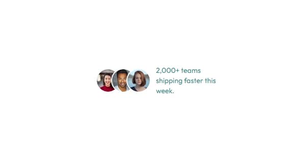
Three stacked avatars that scale and unblur in from the left on an elastic ease, then a caption slides in from the right.
FAQ Accordion
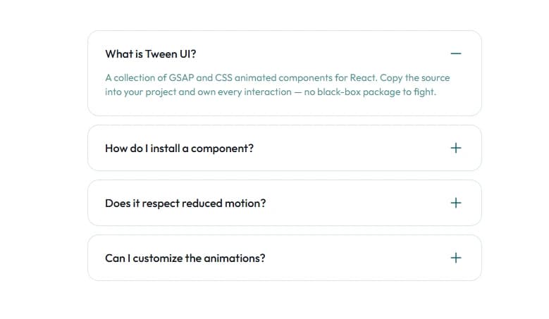
A single-open accordion that animates its height open while the answer reveals line by line through a SplitText mask and the icon morphs from plus to minus.
Flip Card
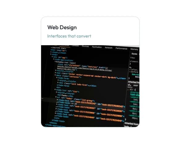
A card that flips in 3D on hover or tap — the front rotates out while the back rotates in with its description, feature list and CTA staggering into place.
Glow Button

A pill button floating over a soft red, amber, violet and cyan glow that sharpens as the button lifts and a chevron slides through its slot. Pure CSS — no GSAP dependency.
Icon Trail Button

A pill button whose icon pill expands on hover or focus, playing out a staggered chevron trail before it parks. CSS transitions and a small state machine — no animation library.
Image Fan Slider

A fan of photos that auto-advances — the active one large and sharp, its neighbors rotated and blurred on each side. Hover pauses. Pure CSS transitions.
Logo Cycle
A logo row that holds a fixed count and cycles the extras: the current set staggers up and blurs out as the next slides in from below. Hover pauses the loop.
Logo Orbit

Logos spaced evenly around a ring that rotates continuously, each mark counter-rotated so it always stays upright. Hover pauses the orbit.
Logo Wave

An endless logo strip where the mark nearest the midpoint rises and scales up while its neighbors step down into a wave. Hover pauses the marquee.
Morphing Text
New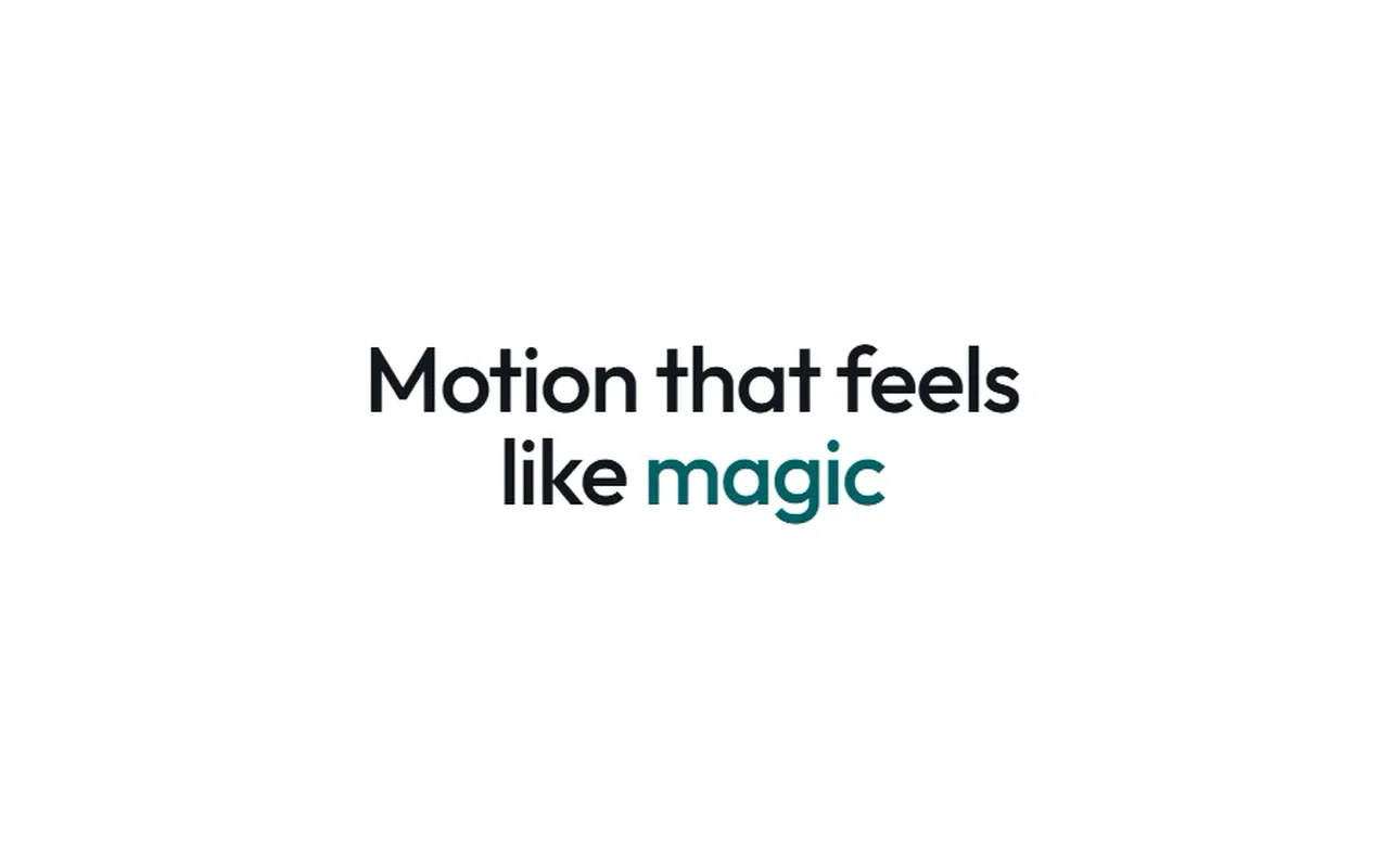
A headline whose last word cycles through a list with a gooey blur morph — an SVG alpha threshold fuses the outgoing and incoming words into one liquid shape while the slot eases between word widths.
Number Counter
Digits that spin up once when the stat scrolls into view. ScrollTrigger fires it, Number Flow handles the count.
Shiny Button

A pill button with a diagonal light sweep that glides across on hover while the leading sparkle twinkles. Pure CSS — no GSAP dependency.
Slide Arrow Button

A pill button whose label rolls up on hover while the chevron slides out of its lime badge and a fresh one slides in from the left. Pure CSS — no GSAP dependency.
Sliding Tabs
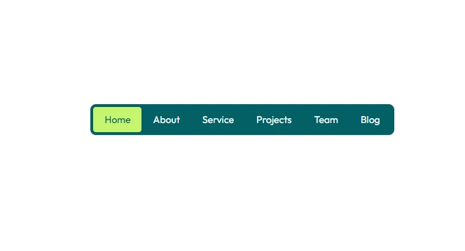
A pill nav whose lime indicator scales in under the first tab, then slides to follow the pointer or keyboard focus. Leaving the nav returns it to the active tab.
Text Roll Button

A pill button whose label rolls up character by character on hover — the current text lifts out the top as a fresh copy rolls in from below, on a fine per-character stagger.
Voice Sample Player
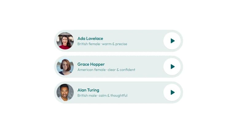
An audio player pill: press play and the name slides away, a lime waveform equalizer slides in and starts oscillating, and the icon morphs to pause. Pass a src to play real audio.
All blocks
22Blog Hover Expand

A three-post blog row where the hovered card grows wider, its photo scales and tilts, and the title draws an underline. Pure CSS.
Card Hover Expand
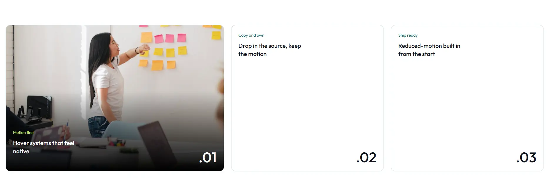
A card row where the hovered card grows wider, its photo fades in and the title drops to the bottom over a gradient. Every card stays expanded on small screens. Pure CSS.
Card Spotlight Grid

A staggered project grid — tile heights cycle every six cards — where the hovered tile tilts toward the cursor in 3D while its siblings scale back and dim. Pointer-only.
Column Drift

Three columns of review cards that swing in from the sides as the section scrolls, then drift past each other at different speeds. Cards lift on hover with an underline wipe. GSAP + ScrollTrigger.
CTA Image Fan

A call-to-action with a fanned photo stack auto-advancing above the headline and a shiny button below. Built from Image Fan Slider and Shiny Button.
CTA Photo Headline
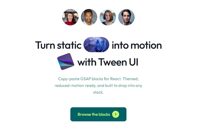
A call-to-action where avatars pop in above a heading with two photos tucked into the copy — a pill that grows from the left, then a tilted square that drops into place.
CTA Starfall

A dark closing section under a slow field of drifting stars lit by a violet bloom. The field is full on the first frame rather than spawning over time, and pauses off-screen and in background tabs.
Cube Roll Item
New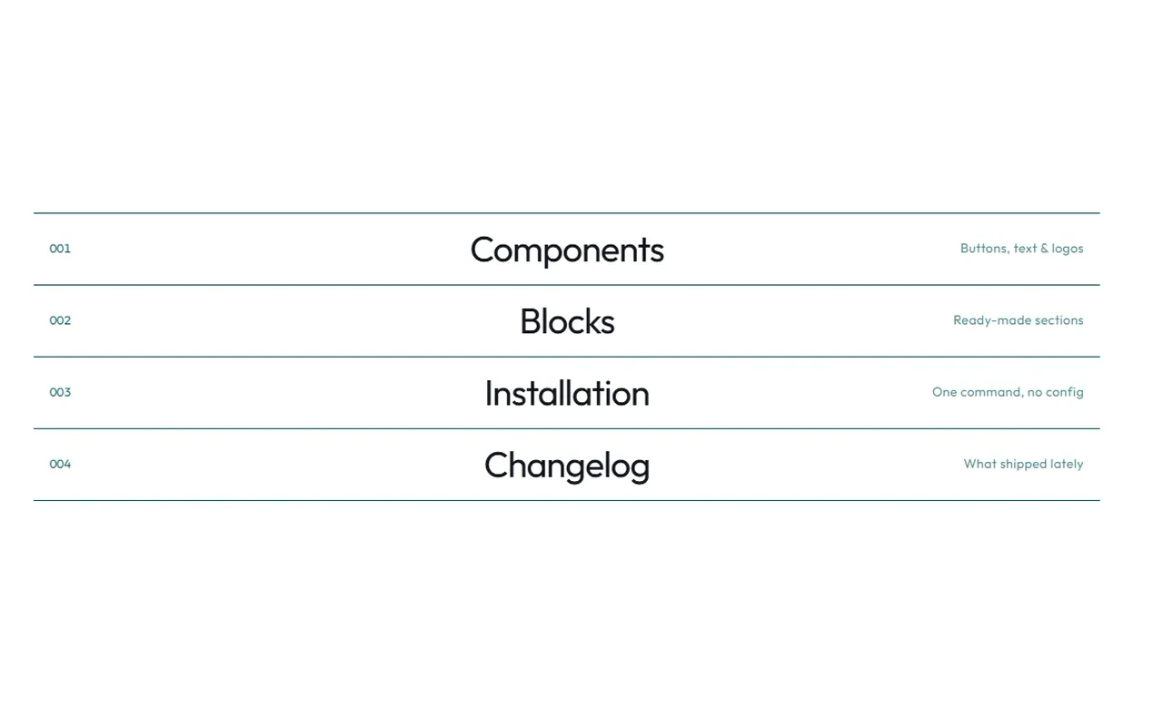
A numbered section index where each row is a 3D drum that rolls a quarter turn onto a filled face on hover. The roll follows the pointer — in from the top rolls down, out through the bottom keeps rolling down — while the rules draw in on load.
Grid Cascade
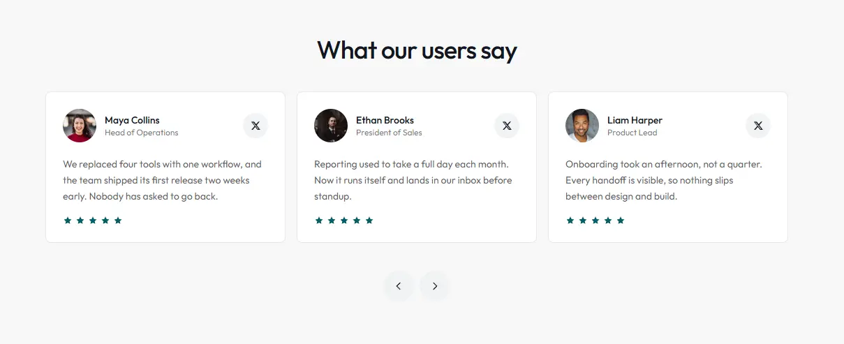
A three-up testimonial grid that pages a whole set at a time — the current cards drop away on a stagger, then the next set cascades in from above, so the two never overlap mid-flight.
Infinite Rotating Cards
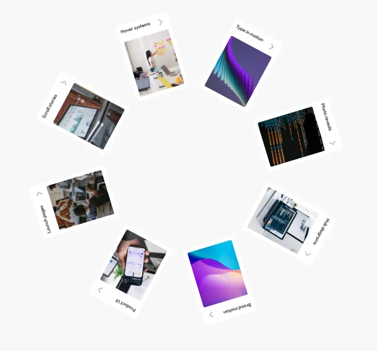
A hero wheel of photo cards set on a large circle so only the top arc shows, spinning slowly so the next idea always comes into view.
Integration Hub

A hub-and-spoke integrations diagram: the center pops in, paths draw out to six logos, then a dot travels each line. Uses MotionPathPlugin.
Logo Wall Shuffle

An integrations wall of staggered logo tiles where one mark at a time lifts away and the next rises in behind it. Every tile is visited before any repeats, and the loop pauses off-screen and in background tabs.
Pricing Plan Switch

A pricing section where picking a plan morphs the name badge, crossfades the description and spins the price with Number Flow, while the checklist lights up its included rows. A monthly/yearly toggle re-spins the price.
Pricing Usage Slider
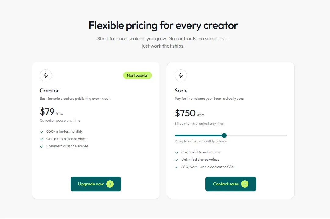
A two-plan pricing section where the second card prices itself from a volume slider, the figure spinning with Number Flow as you drag while the track fills behind the handle.
Process Card Reveal
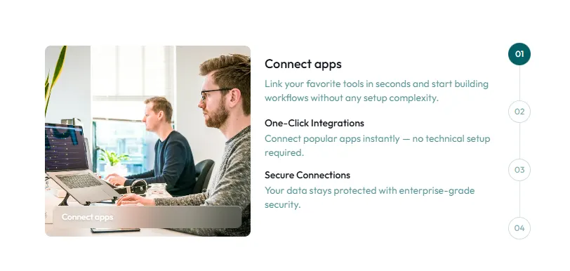
Numbered steps on a timeline whose connector fills before the next card slides and blurs into place — image one way, copy the other. Hover pauses the loop; clicking a step jumps there.
Process Sticky Steps
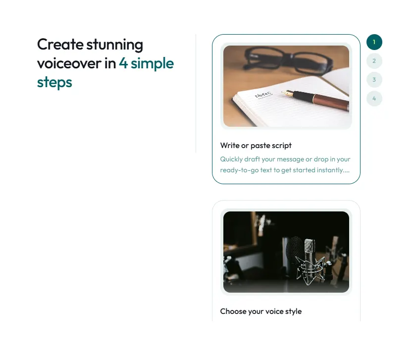
A process block whose heading, divider and step numbers stay sticky inside the section while the cards scroll past them. No GSAP — just Intersection Observer.
Rating Carousel

A Swiper testimonial row of rating cards: drag or swipe it, and off-window cards fade and blur as they leave. Autoplay pauses on hover, and dots jump to a card.
Shutter Slider
New
An autoplaying feature slider. Each image opens through vertical slats that alternate from the top and bottom, the headline letters roll in like drum faces, copy lines rise through masks and the caption pulls into focus — all mirrored when you travel back.
Strip Wipe

A split testimonial slider whose photo wipes in as tiled strips beside the quote, the index ticking over on Number Flow. Prev and next reverse the wipe direction.
Tab Wipe

A centered screenshot stage that wipes between slides on a clip-path edge while the incoming shot settles out of a slight scale and drift. The thumbnail strip is a real tablist, and the stage autoplays between clicks.
Team Scatter Focus

A scattered team collage whose cards each fly in from their own direction, then blur and shrink back from whichever one you hover. Falls back to a stacked grid below lg.
Testimonial Line Sweep

A paged testimonial pair whose text sweeps out line by line behind masks while the portrait irises shut, then the next quote arrives the same way. Pages with buttons or arrow keys. GSAP + SplitText.