Live
Every preview is the real component.
Hover any of these. It is the same file the CLI writes into your project.
Why Tween UI
What you get
Tween UI is not a dependency. It is source code with a good install story.
One file per component
The CLI writes a single .tsx into your project. Rename it, restyle it, delete half of it — nothing upstream breaks.
GSAP where it matters
Timelines, ScrollTrigger and SplitText drive the sequenced work. Anything simpler stays a plain CSS transition.
Reduced motion, always
Every component checks prefers-reduced-motion and renders its finished state instead of animating.
Icon Trail Button
A pill button whose icon pill expands on hover or focus, playing out a staggered chevron trail before it parks. CSS transitions and a small state machine — no animation library.
Sliding Tabs
A pill nav whose lime indicator scales in under the first tab, then slides to follow the pointer or keyboard focus. Leaving the nav returns it to the active tab.
Number Counter
Digits that spin up once when the stat scrolls into view. ScrollTrigger fires it, Number Flow handles the count.
Flip Card
A card that flips in 3D on hover or tap — the front rotates out while the back rotates in with its description, feature list and CTA staggering into place.
Logo Orbit
Logos spaced evenly around a ring that rotates continuously, each mark counter-rotated so it always stays upright. Hover pauses the orbit.
Avatar Reveal
Three stacked avatars that scale and unblur in from the left on an elastic ease, then a caption slides in from the right.
FAQ Accordion
A single-open accordion that animates its height open while the answer reveals line by line through a SplitText mask and the icon morphs from plus to minus.
Image Fan Slider
A fan of photos that auto-advances — the active one large and sharp, its neighbors rotated and blurred on each side. Hover pauses. Pure CSS transitions.
Blocks
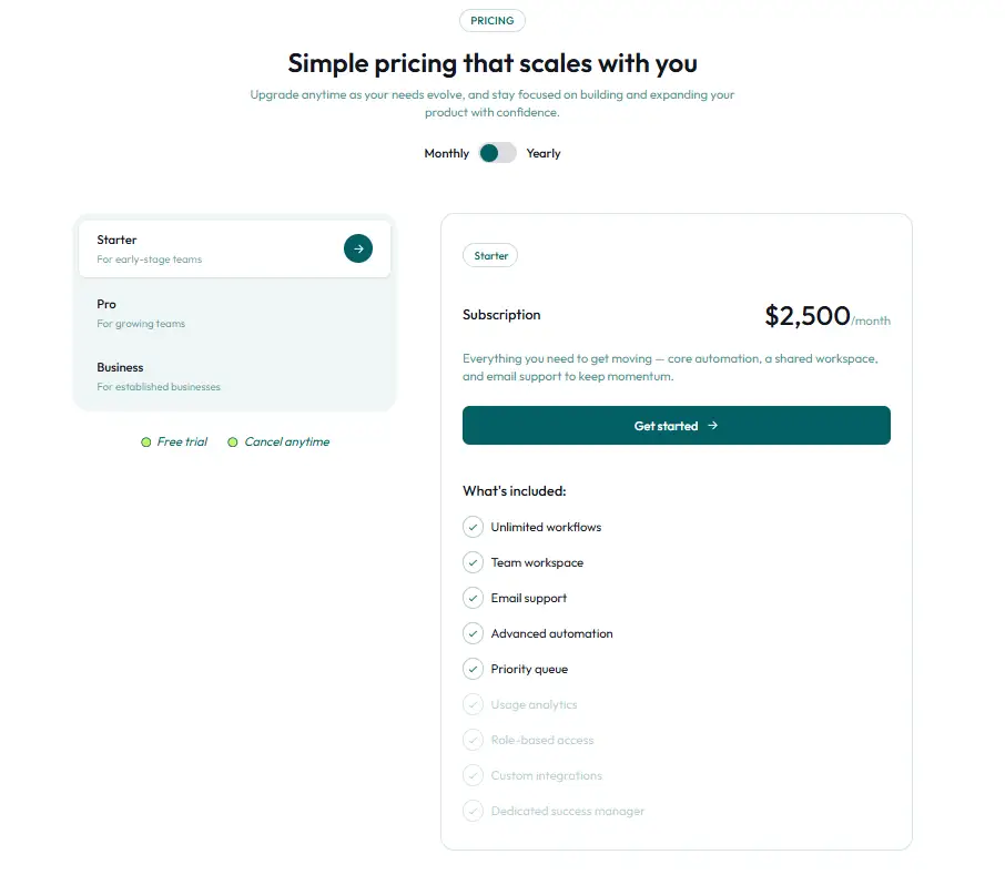
22 full page sections.
Heroes, pricing tables, testimonials, CTAs. Same rules as the components: one file, copy it, change it.