
Blocks
Navbar Pill Glide
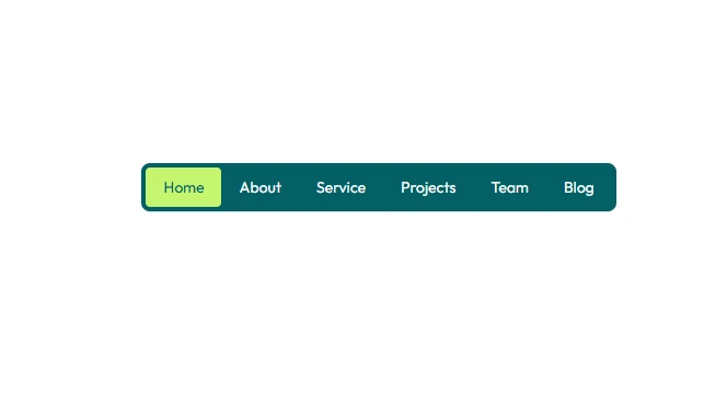
A navbar whose links sit in a frosted pill, with a highlight that glides to the one you point at.
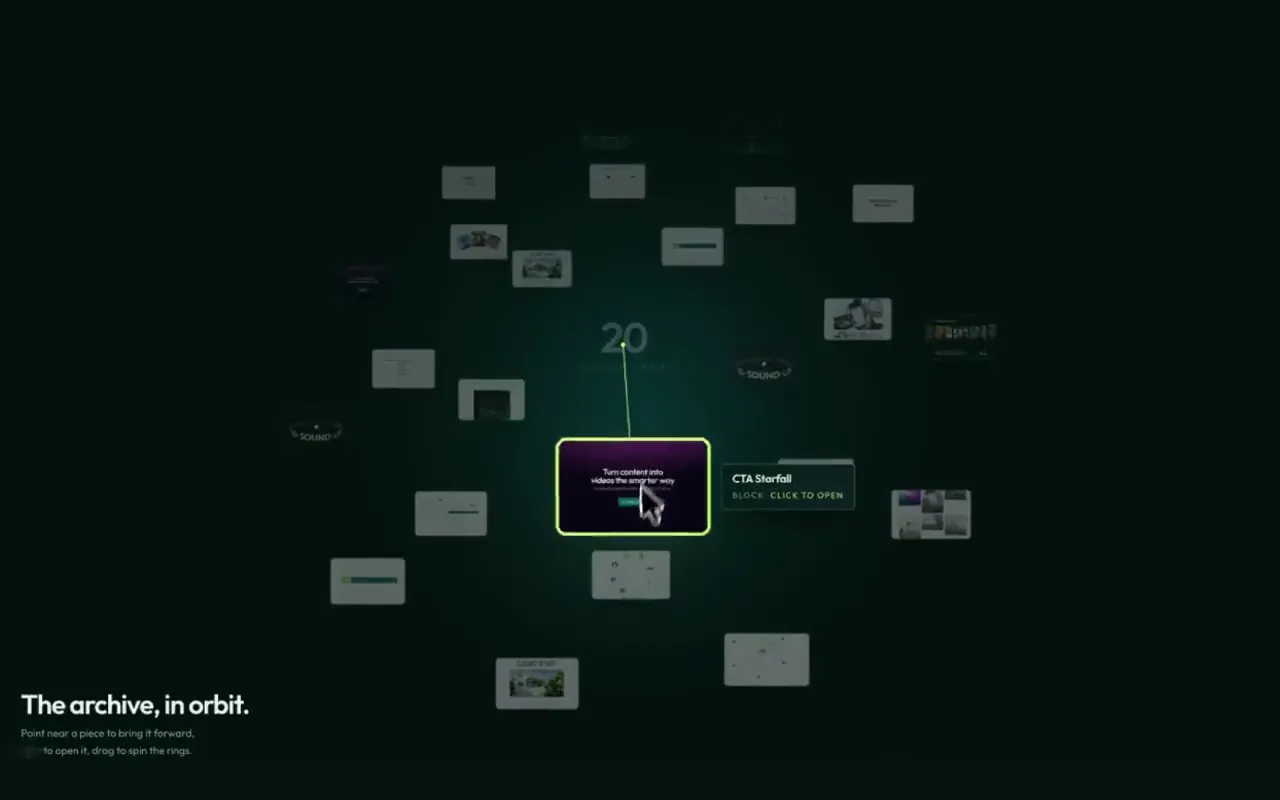
A site navbar built around one frosted pill of links. Sweep the pointer across it and a soft highlight glides from link to link, stretching to each one's width, then fades when you leave. A lime line along the pill's bottom edge fills as you scroll down the page, and the whole bar slips away going down and drops back going up. Below 1024px the pill folds into a round toggle that wipes the full menu open as a circle grown from the button, with large rolling links and a poster that swaps as you point at each one. GSAP.
Installation
pnpm dlx shadcn@latest add @tween-ui/navbar-pill-glideUsing an AI editor? Set up MCP once, then just ask for it in plain words.
Usage
import NavbarPillGlide from '@/components/tweenui/navbar-pill-glide';

export default function Page() {
  return <NavbarPillGlide />;
}
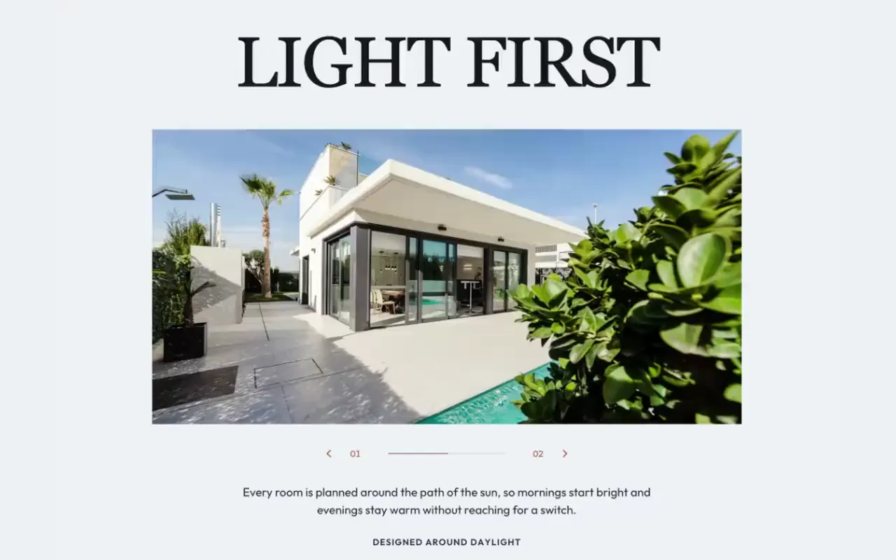
It ships dressed as the Tween UI site, with a single hero as the page and the
library's own gallery posters in the mobile menu. It fills the screen height
(h-svh, never shorter than 560px), and the bar, the menu and the hero share a
max-w-7xl container. Put your page inside it and pass your own links and
actions:
import NavbarPillGlide from '@/components/tweenui/navbar-pill-glide';

export default function Layout({ children }: { children: React.ReactNode }) {
  return (
    <NavbarPillGlide
      brand="Kairo"
      currentHref="/pricing"
      email="hello@kairo.studio"
      primaryAction={{ label: 'Start free', href: '/signup' }}
      secondaryAction={{ label: 'Book a demo', href: '/demo' }}
      links={[
        { label: 'Home', href: '/', image: '/menu/home.jpg' },
        { label: 'Customers', href: '/customers', image: '/menu/customers.jpg' },
        { label: 'Pricing', href: '/pricing', image: '/menu/pricing.jpg' },
        { label: 'Journal', href: '/journal', image: '/menu/journal.jpg' },
      ]}
    >
      {children}
    </NavbarPillGlide>
  );
}
The colors are the Tween UI palette: the deep ink stage (#03110f), a lifted
ink for the pill and toggle (#071d1b), pale type (#e8f3f2), soft teal for
quiet links and borders (#9fd4d6) and the lime accent (#c6f56f) on the
progress line, the primary button and the current page in the
menu. They live in the className strings, so you can restyle them in place.
Props
| Prop | Type | Default | Description |
|---|---|---|---|
brand | string | 'Tween UI' | Name beside the logo, and the section's label. |
logo | ReactNode | The Tween UI mark | Shown before the brand name. |
homeHref | string | '/' | Where the logo links; that link stays out of the pill. |
links | NavbarPillGlideLink[] | Five Tween UI pages | The pill links and the mobile menu, in order. |
currentHref | string | '/' | The page you are on; nested paths count too. |
primaryAction | NavbarPillGlideAction | Get started | The lime button, always shown. |
secondaryAction | NavbarPillGlideAction | GitHub | The outline button, shown from 1280px. |
socials | NavbarPillGlideSocial[] | GitHub | Round links at the foot of the mobile menu. |
email | string | none | A mail link at the foot of the mobile menu. |
children | ReactNode | A sample hero | The page under the bar. |
Each link is { label, href, image? }; the image is the poster the mobile menu
shows while you point at that link. Actions are { label, href }. Socials are
{ label, href, icon } with icon one of 'github', 'x', 'linkedin' or
'dribbble'. Extends native <section> attributes (className, style, …).
Behavior
- The highlight measures, it does not guess. Each glide reads the link's box and moves the highlight to its left edge and width over 0.55s on an expo-out curve, so labels of any length line up. Coming in from outside the pill it appears on the link at once instead of sliding in from the left.
- Scroll is read from the page inside. The progress line and the hide-on-scroll all follow the block's own page. The bar only hides after 240px and past a few pixels of travel, and never while the menu is open.
- The menu opens from the button. The circle wipe is centred on the toggle, wherever the layout puts it, and closes back into it. Links rise in 60ms apart as it opens and lift away faster as it closes.
- The menu belongs to small screens. Widen past 1024px with it open and it closes, since the pill has taken over.
- Hover rolls, press squeezes. Every link and button rolls its letters on hover, the buttons fill from the centre, the primary arrow swaps out for a fresh one, and a press scales a button to 96%.
Accessibility
The pill is a labelled nav and the current page carries
aria-current="page". The toggle is a real button with aria-expanded and
aria-controls, its name switching between Open menu and Close menu. The menu
is inert while closed and the page is inert while it is open, so the tab
order only holds what you can see. Escape closes the menu and returns focus to
the toggle. Rolling labels keep one readable copy for screen readers. Under
prefers-reduced-motion: reduce there is no intro, roll, glide or wipe: the
highlight jumps, the menu appears and disappears at once.